


The chart tools in PowerPoint and Keynote are very powerful and quite capable of producing perfectly good charts. But if you want to differentiate your presentation, not to mention make it more memorable and therefore more effective, why not try getting creative with data?
Firstly, think about the information you are trying to get across when presenting data. What’s the important point or message that you want to hammer home. When you’ve decided that, it’s then much easier to get rid of all the clutter so that you are producing a slide whose sole aim is to convey that point.
If you just want to use a simple bar, line or pie chart then fine. But you can zhoosh up a slide which not only make it more striking and effective but also makes the slide creation process more fun, so it’s a win-win.
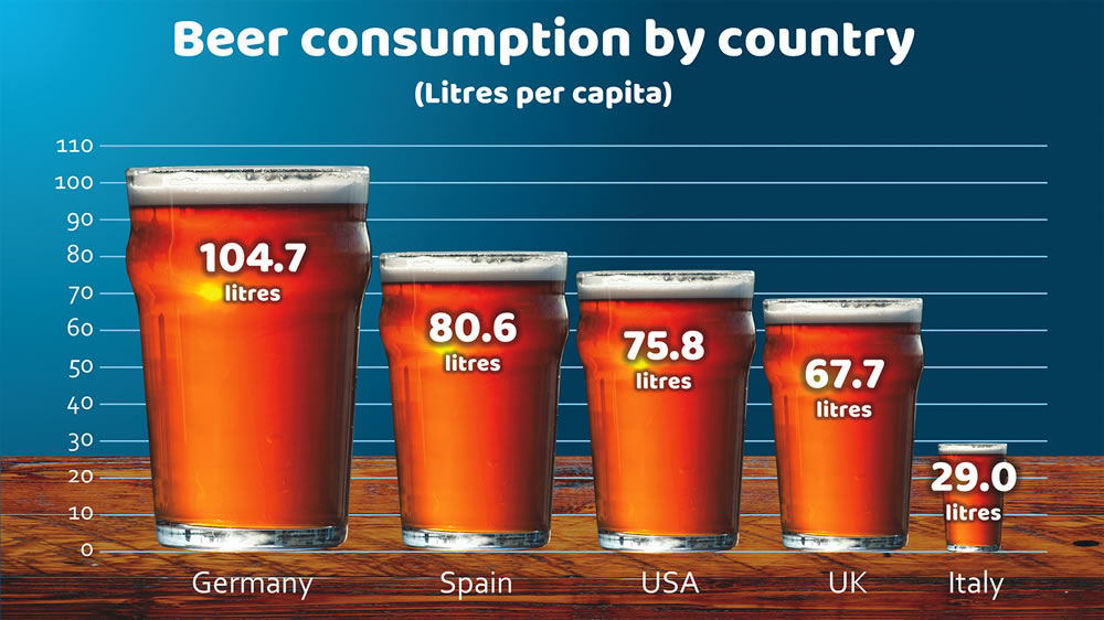
The chart below helps to illustrate the data in a visually more exciting way.
This video explains exactly how to do it.
Here are five more examples of creative data charts.
So next time you are presenting data, have a think about how you can make it more creative to help keep your audience engaged and to help them remember your message long after the presentation.
Have fun!