


Here are some presentations that I've produced that show how to convey information visually and effectively.
All of these were produced in PowerPoint. I can design and produce presentations for you or train your team in how to design presentations that will work for your organisation.
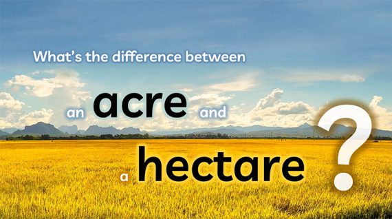
Another visualisation I've produced in PowerPoint, this one explaining what acres and hectares are and the difference between them.
This presentation uses various techniques such as:
- Panning using the motion path animation
- Morph transition
- Image effects - blurring
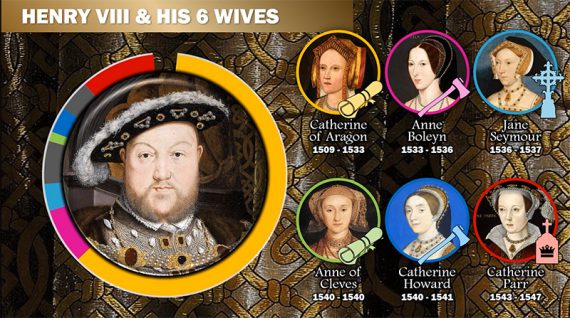
Here’s another slide sequence I created, completely in PowerPoint.
The elements used in this slide include…
- 7 public domain images (Henry VIII and his 6 wives) – free to use as they are out of copyright.
- Animations a-plenty and particular use of the morph transition to bring out the images of each of the wives and then move them into their final positions.
- And data visualisation techniques – the colour coding used for the duration of each of the King’s wives and around the edge of their pictures.
- It’s made up of 13 slides but hangs together as one story.
It clearly shows that Henry VIII was married to Catherine of Aragon for much longer than the other five wives put together. Did you know that?
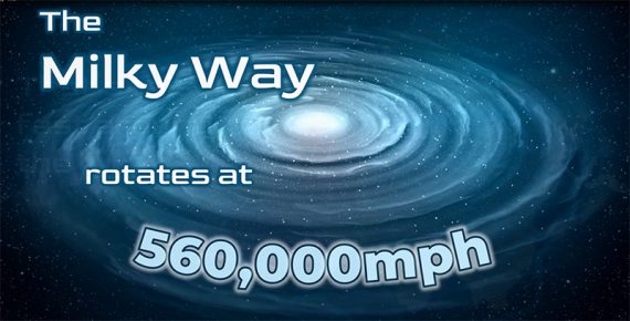
Here's another video, this one illustrating the wonders of the Milky Way as well as the power of PowerPoint (if it's used properly).
The techniques used in this presentation are transitions and animations, Word Art, glowing text effects, video import, image import with transparency and audio import (turn up your sound for some relaxing music!).
It took me around 2½ hours to complete.
If you want to learn how to do this sort of thing then join me in one of my masterclasses, or sign up your team to an in-house masterclass.
Or if you'd like me to design your presentation from the point of view of a communicator and information visualiser, a presentation that will really nail home your message, let me know, I'd be happy to help.
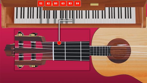
I've been playing about with this little guitar tuning sequence – all done in PowerPoint.
The techniques involved were:
* Importing existing 3D models
* The morph transition
* Importing audio files (recorded from my piano and guitar)
* And, of course, the full animation sequence
* Finally exporting to video (which PowerPoint does really well)
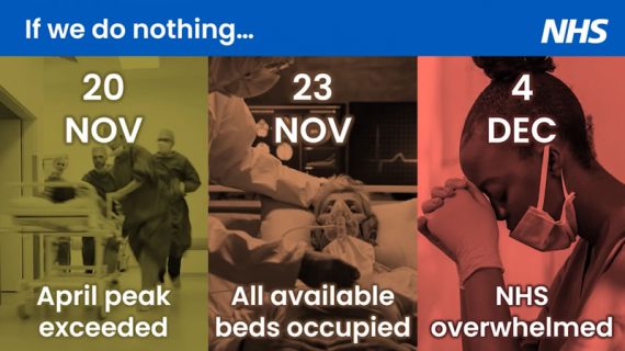
I got a lot of great feedback on my transformation of the government Covid briefing slide - see the presentation below. However, what I produced was still a graph. Do you think it would be better to appeal to people's emotions? Here's a short sequel to the previous presentation showing how this could be done.
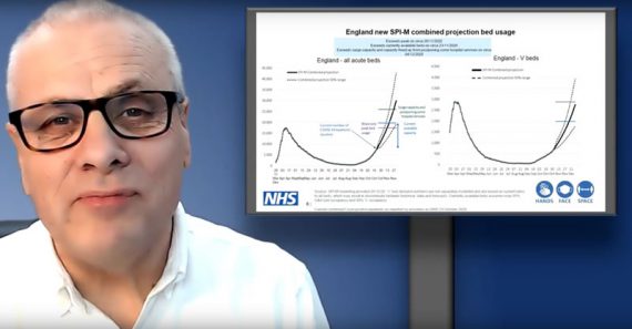
This is the story of one of the slides used by the government in their briefing at the end of October 2020 to justify the new lockdown. The presentation of the information had the potential to save lives and would influence whether people were inclined to stay in or disobey the rules. Do you think they did a good job? I highlight the mistakes that I think they made and produce what I hope is a better version.
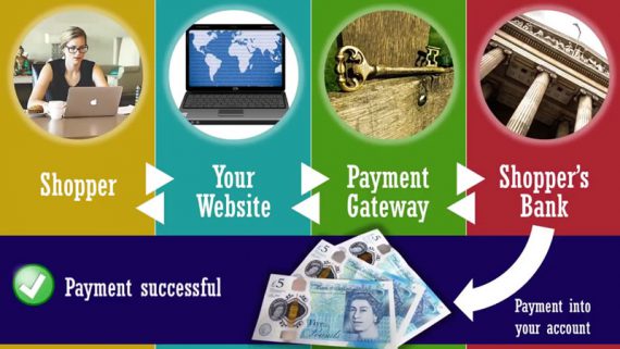
Explaining a complex process of any kind is going to be difficult without some form of visual backup. This slide helps to break down each part of the process as the speaker is describing it.
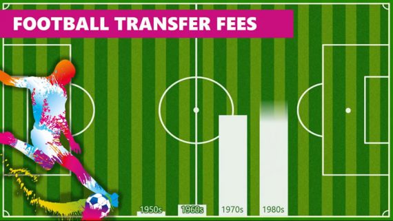
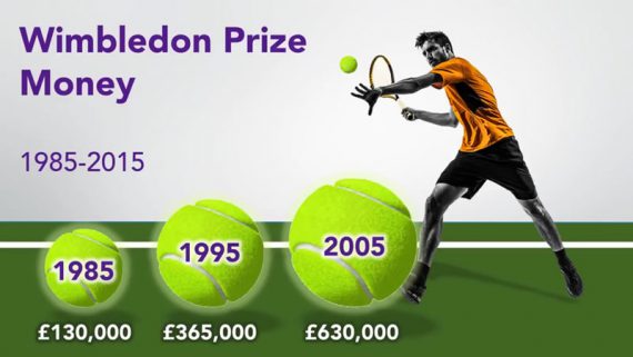
Hitting the audience with a bunch of figures is all well and good but the comparison you are trying to make is not going to be clear in their mind if they are just hearing you talk. This sequence of slides clearly illustrates the changes in the amounts over the decades and helps to clarify what the presenter is saying.
Here are five slides that show how data can be presented creatively. The charts also use effective animation to build up as the speaker is talking.
This presentation ticks all the boxes as far as simplicity is concerned. There's no superfluous elements on the slides. The only things that appear on the slides are things that are related to getting the message across.