


I don’t want to give the impression that I’m obsessed with beer in my articles but there have been a couple of posts that have featured said elixir. The first was the filling Guinness glass produced for Phillip Khan-Panni and the second time was the creative chart using different sizes of beer glass.
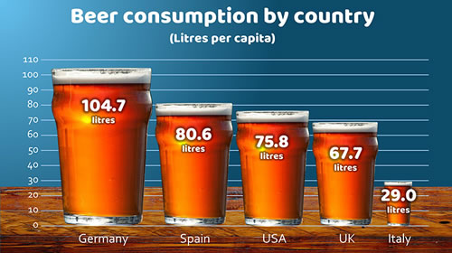
Someone who saw both suggested to me that it would be great to combine the two – in other words, produce a ‘bar’ chart like the one in the second image above but with the glasses filling up.
‘How difficult could that be?’ I asked myself. Actually, trickier than I first thought.
The main issue was to make the glasses and the beer inside look realistic. Overlaying the beer just obliterated the glass. Trying to make the beer semi-transparent didn’t help; it just looked very watered down. Putting the beer behind the glass produced the same problems.
So, I had to get creative and ended up producing two layers for the glasses and sandwiching the rising beer in between.
And this is the important point – if you want to be good at producing slides, you don’t just need to learn how to use PowerPoint properly but also how to edit and manipulate images. The combination of these two skills will enable you to produce slides that will wow your audience. My slide presentation masterclass covers images in detail.
These are the two images I ended up producing:
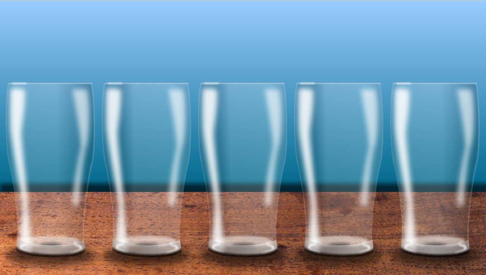
The back image is a set of drawn glasses. Each glass contains 13 separate elements to create the outline, the highlights and the shadows. The main image techniques used to create this were gradient fills, feathered edges, drop shadows and varying degrees of opacity. But to make it realistic, I had to produce a front layer.
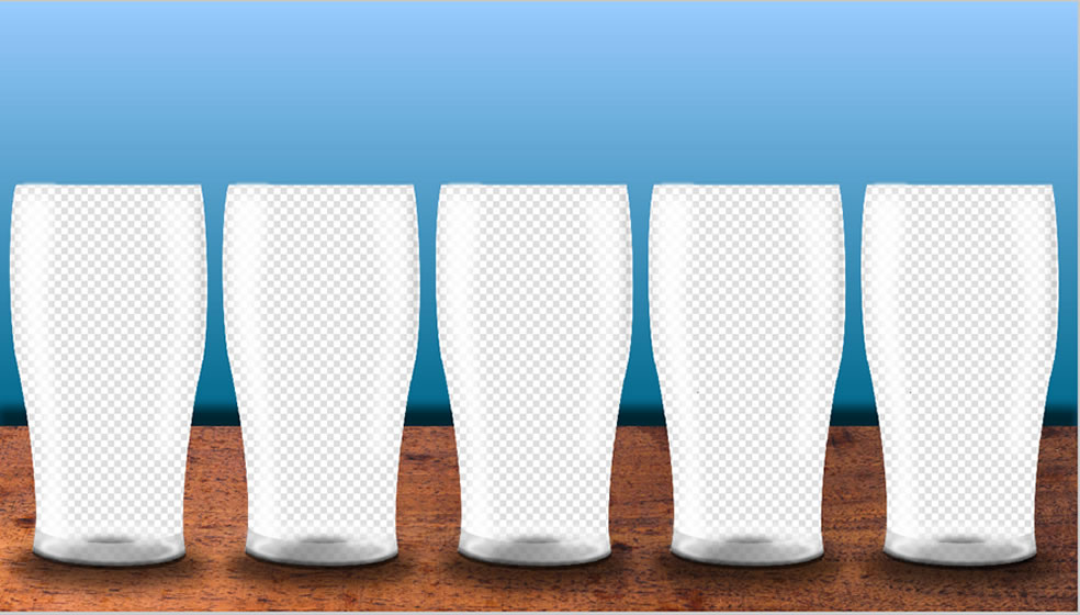
The glasses in the front layer are basically holes in the images but with the light reflections added back in. The chequered part of the image above is where the background is showing through. I had to play about with these a bit to get them looking right when ‘beer’ was added between the two layers.
Then all I had to do was to produce the beer – a nice pale ale! The basic beer shape that starts off below the glasses looks like this:
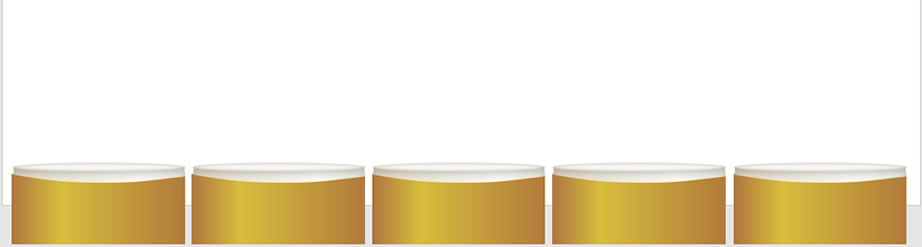
This is made of three shapes – the beer, the head and the top of the head.
It was then a matter of using PowerPoint’s excellent morph transition to show the beer filling up in the glasses, moving and resizing all three shapes into their new positions in the glass.
And here’s the result: