


I had a kind of light bulb moment this week. Of course, I’m always going on about how great-looking slides are going to boost the effectiveness and engagement of your presentation but here’s the thing I discovered: In most cases it doesn’t matter if your slides suck. “What? Have you gone mad Dave?” I hear you ask. “Are you feeling OK?” Well, I did say in most cases.

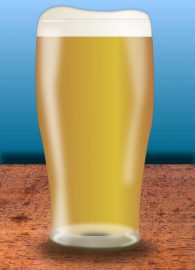
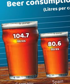
I don’t want to give the impression that I’m obsessed with beer in my articles but there have been a couple of posts that have featured said elixir. The first was the filling Guinness glass produced for Phillip Khan-Panni and the second time was the creative chart using different sizes of beer glass. Someone who saw both suggested to me that it would be great to combine the two – in other words, produce a ‘bar’ chart like the one in the second image but with the glasses filling up. ‘How difficult could that be?’ I asked myself. Actually, trickier than I first thought.
Sometimes people struggle to know if they should or should not be using slides. They often use slides when they shouldn’t do and sometimes they give a talk without slides where a slide would be really useful to help with some of the points they are making.
This video explains all about RICE, a handy acronym to help you to determine if you should be using a slide to get your message across.

I was asked recently to supply some before and after examples of PowerPoint presentations so I thought it would be a good opportunity to put together a short video article with a handful of these examples.
Knowing how to use PowerPoint (or Keynote or Prezi or whatever you use) is completely different from knowing how to use PowerPoint. (Duh, that’s the same thing on both sides of the equation Dave!) Yes, but you know what I mean – really knowing how to use PowerPoint.
It’s a bit like riding a bike. When you were a young child and had never ridden a bike, you probably thought you knew how to ride a bike. It couldn’t be easier. You sit on a saddle, put your feet on the pedals and move your feet round and round.

The chart tools in PowerPoint and Keynote are very powerful and quite capable of producing perfectly good charts. But if you want to differentiate your presentation, not to mention make it more memorable and therefore more effective, why not try getting creative with data?
One of the newest features of PowerPoint is the ability to bring in 3D models and manipulate them. It can be a really useful feature especially if you want to show off all the attributes of a product for example.
In this video clip, I have produced a title slide that shows simply how to bring 3D models into PowerPoint and use the morph transition to move them on screen.

As I pointed out in a previous article, PowerPoint can be used for things other than for speaking. And I promised I would expand upon some of these, so here goes.
The first usage I want to cover is still concerned with speaking. It’s inspired by people who tell me that they only use PowerPoint as a prop, and I hear that a lot!

When producing presentations, more often than not, I am taking a slide deck that someone has already created and transforming it into something that is far more effective and compelling.
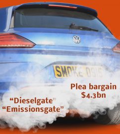
Recently I worked on a presentation for a company that was launching an IPO. There were several slides in the presentation, but I want to show you just one and how I changed it from a very plain and busy slide into a set of slides that really worked the way the client wanted.

What do you think of this slide? If you've read my posts (or better still my book) you'll know that two things I rail against constantly are complexity and too much text. This slide breaks both of those rules so it's rubbish isn't it? Well, actually...

A bouncing ball animation (and other stuff)
It’s OK if your slides suck
The beer slide revisited
When should I use slides?
Before and after slide examples
Having someone else operate your slides
Do you really know how to ride a bike?
The hardest PowerPoint presentation
Want to avoid this feeling? Then rehearse, rehearse and rehearse some more
Other ways of using PowerPoint – Producing video